
library(dplyr)
library(ggplot2)
library(stringr)
library(lubridate)
library(rnaturalearth)
library(sf)
library(magick)Why GIF Maps?
Animated maps often appear technically intimidating, but the underlying mechanism is quite straightforward. A GIF is essentially a stack of still images presented in rapid succession. Creating an animated map in R involves generating a sequence of static maps representing distinct time periods, saving each as an image file, and then stitching them together into a continuous animation.
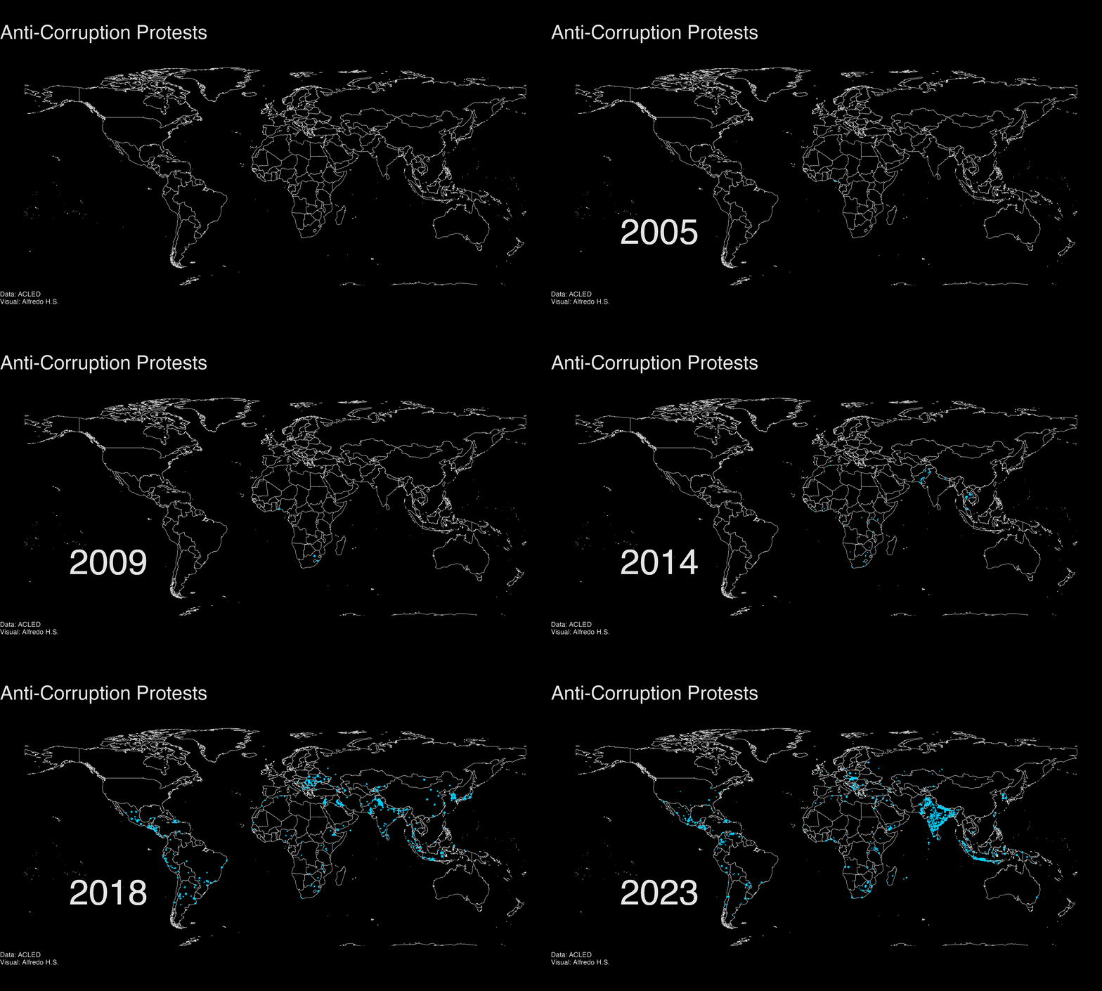
Animated maps are highly effective for showing movement and change. However, they are generally poorly suited for allowing a reader to make precise comparisons of magnitudes between specific points in time. If your audience needs to scrutinize specific data points or compare subtle differences between two specific years, a static faceted plot or a well-formatted table is usually a better choice.
The example in this tutorial relies on a dataset of world protest events regarding corruption, sourced from ACLED (Armed Conflict Location & Event Data Project). We cover the general workflow for map animation in R: inputting spatial data, generating iterative frames, and compiling those frames into motion.
The Packages
- The
dplyrpackage handles standard data operations like filtering rows and creating variables. - Spatial data, which includes geographic coordinates and shapes like country borders, is managed by the
sfpackage. - We obtain the underlying map geometries using
rnaturalearth. - For drawing the actual maps layer by layer, we turn to
ggplot2. - Finally, the
magickpackage handles the task of reading the individual map images and compiling them into a final GIF. - We also load
stringrandlubridatewhich are commonly used when working with text and date variables in raw event datasets (data cleaning).
As a useful heuristic: sf understands geography, ggplot2 draws the frames, and magick creates the motion.
The Data Needed
For an animated event map, each observation in the dataset must contain at least three pieces of information: a) the geographic location of the event, the time the event occurred, and the key variable(s) (like crowd size or event type) that should represent the event on the map.
In this tutorial, we read a pre-processed local file (input/df_coord_acled.rds) that already contains these ingredients.
| event_id_cnty | event_date | year | country | event_type | crowd_size |
|---|---|---|---|---|---|
| SYR96111 | 2021-11-01 | 2021 | Syria | Protests | 10 |
| KOR6170 | 2020-09-22 | 2020 | South Korea | Protests | 1 |
| IND36227 | 2018-09-08 | 2018 | India | Protests | 1 |
| GHA208 | 2013-10-03 | 2013 | Ghana | Protests | 1 |
| IRQ21735 | 2019-10-31 | 2019 | Iraq | Protests | 1 |
| BGR1320 | 2020-08-18 | 2020 | Bulgaria | Protests | 1000 |
| BGR1167 | 2020-07-24 | 2020 | Bulgaria | Protests | 1 |
| DRC21731 | 2021-06-30 | 2021 | Democratic Republic of Congo | Protests | 1 |
| YEM65074 | 2018-08-04 | 2018 | Yemen | Protests | 1 |
| EGY9630 | 2011-02-18 | 2011 | Egypt | Protests | 100 |
Notice that the object name is df_coord_sf. The _sf suffix serves as a reminder that this is not an ordinary data frame. It is an sf (simple features) object, containing a dedicated geometry column that tells R precisely where each point belongs on the Earth’s surface.
| first_year | last_year | events | countries |
|---|---|---|---|
| 2001 | 2023 | 10826 | 151 |
Data Preparation (Optional)
If you are interested in the full workflow starting from raw data, the code block below shows how the ACLED data was retrieved and cleaned. It demonstrates how to pull data using the acled.api package and use regular expressions to parse crowd sizes from text notes. This block is set not to run automatically to save time and because it requires an active API key, but the code remains available for reference.
Show the API extraction and data cleaning code
library(acled.api)

# A registered access key and email are required to use the API
acled_key <- "YOUR_API_KEY_HERE"
email <- "YOUR_EMAIL_HERE"

acled_india <- acled.api(
  email.address = email,
  access.key = acled_key,
  country = "India",
  all.variables = TRUE
)

# Filter for protests involving corruption and clean text to extract numeric crowd sizes
acled_corr_india <- acled_india %>%
  mutate(event_date = ymd(event_date)) %>%
  filter(event_type == "Protests") %>%
  mutate(keyword = str_detect(tolower(notes), "corrup")) %>%
  filter(keyword == TRUE) %>%
  mutate(
    tags = str_replace_all(tags, c("dozens" = "10", "dozen" = "10", "tens" = "10",
                                   "some" = "10", "handful" = "10", "small" = "10",
                                   "scores" = "20", "big" = "100", "large" = "100",
                                   "several" = "100", "sizeable" = "100", "many" = "100",
                                   "huge" = "1000", "1000s" = "1000", "massive" = "10000",
                                   "hundreds" = "100", "thousand" = "1000",
                                   "thousands" = "1000", "10 of 1000s" = "10000",
                                   "millions" = "1000000")),
    crowd_size = str_extract(str_remove_all(tags, ","), "\\d+$"),
    crowd_size = ifelse(is.na(crowd_size), str_extract(tags, "[:digit:]+"), crowd_size),
    crowd_size = as.numeric(crowd_size),
    crowd_size = ifelse(is.na(crowd_size), 1, crowd_size)
  )

# Convert the regular data frame to an sf object using standard GPS coordinates (CRS 4326)
df_coord_sf <- st_as_sf(
  acled_corr_india,
  coords = c("longitude", "latitude"),
  crs = 4326
) %>% st_transform()
Step 1: Set Up a Base Map and Theme
Every event map requires a base layer to provide geographic context. We use a simple world map provided by the Natural Earth project. The ne_countries() function retrieves these borders, and setting returnclass = "sf" ensures the result works seamlessly with ggplot2.
world <- ne_countries(scale = "medium", returnclass = "sf")Because animated maps require rendering many plots that share the exact same aesthetic design, it is highly efficient to define a custom ggplot2 theme early on. This custom theme establishes a dark background, removes distracting grid lines and axes, and sets consistent text sizes. Saving this as an object (theme_anim_map) prevents us from having to copy and paste twenty lines of styling code for every subsequent map.
theme_anim_map <- theme_void() +
  theme(
    panel.background = element_rect(fill = "black", color = NA),
    plot.background = element_rect(fill = "black", color = NA),
    plot.title = element_text(size = 25, color = "gray90", face = "bold"),
    plot.caption = element_text(hjust = 0, color = "gray90"),
    plot.margin = margin(5, 5, 5, 5)
  )
Step 2: Draw One Static Map
The most important debugging habit for map animation is to successfully create a single static map before attempting a loop. If a single frame is misconfigured, automating the process will simply generate dozens of flawed frames.
We start by placing our base map onto the plotting canvas using geom_sf(), configuring the map bounds with coord_sf(), and applying our newly created theme.
ggplot() +
  geom_sf(data = world, color = "gray90", fill = "gray0") +
  coord_sf(xlim = c(-180, 180), ylim = c(-60, 90)) +
  theme_anim_map
Next, we overlay the protest events for a single test year, such as 2023. We filter the data specifically for that year and map the point size to the transformed crowd size.
one_year <- 2023

ggplot() +
  geom_sf(data = world, color = "gray90", fill = "gray0") +
  geom_sf(
    data = filter(df_coord_sf, year == one_year),
    color = "#00CFFF",
    aes(size = log(crowd_size + 1)),
    alpha = .8,
    show.legend = FALSE
  ) +
  coord_sf(xlim = c(-180, 180), ylim = c(-60, 90)) +
  theme_anim_map
The data filtering step (filter(df_coord_sf, year == one_year)) isolates the events. The aesthetic mapping (aes(size = log(crowd_size + 1))) transforms the data logarithmically, ensuring that extraordinarily large events do not visually overwhelm the map, while adding 1 prevents mathematical errors if crowd size values are zero.
Step 3: Add Labels and Structure
An animated map needs sufficient visual structure for the reader to understand the passage of time. A prominently placed year label is essential because it anchors the viewer in the current frame. We add text and adjust the point scaling to finalize the map’s appearance.
ggplot() +
  geom_sf(data = world, color = "gray90", fill = "gray0") +
  geom_sf(
    data = filter(df_coord_sf, year == one_year),
    color = "#00CFFF",
    aes(size = log(crowd_size + 1)),
    alpha = .8,
    show.legend = FALSE
  ) +
  scale_size(range = c(.1, 1)) +
  coord_sf(xlim = c(-180, 180), ylim = c(-60, 90)) +
  geom_text(aes(x = -120, y = -30, label = one_year), color = "gray90", size = 16) +
  labs(
    title = "Anti-Corruption Protests",
    caption = "Data: ACLED \nVisual: Alfredo H.S."
  ) +
  theme_anim_map
The function scale_size() manages the minimum and maximum dimensions of the points. geom_text() positions the active year label directly onto the plot, while labs() handles the overarching titles and data sourcing notes.
Step 4: Save One Frame
Once the static map looks correct, save it as an image. While ggsave() will save the last plot shown by default, explicitly saving the assigned plot object is generally more reliable. We must also explicitly set the dimensions to ensure uniformity across all future frames.
map_2023 <- ggplot() +
  geom_sf(data = world, color = "gray90", fill = "gray0") +
  geom_sf(
    data = filter(df_coord_sf, year == 2023),
    color = "#00CFFF",
    aes(size = log(crowd_size + 1)),
    alpha = .8,
    show.legend = FALSE
  ) +
  scale_size(range = c(.1, 1)) +
  coord_sf(xlim = c(-180, 180), ylim = c(-60, 90)) +
  geom_text(aes(x = -120, y = -30, label = 2023), color = "gray90", size = 16) +
  labs(title = "Anti-Corruption Protests", caption = "Data: ACLED") +
  theme_anim_map

dir.create("images", showWarnings = FALSE)

ggsave(
  filename = "images/map_2023.png",
  plot = map_2023,
  width = 25,
  height = 15,
  units = "cm"
)
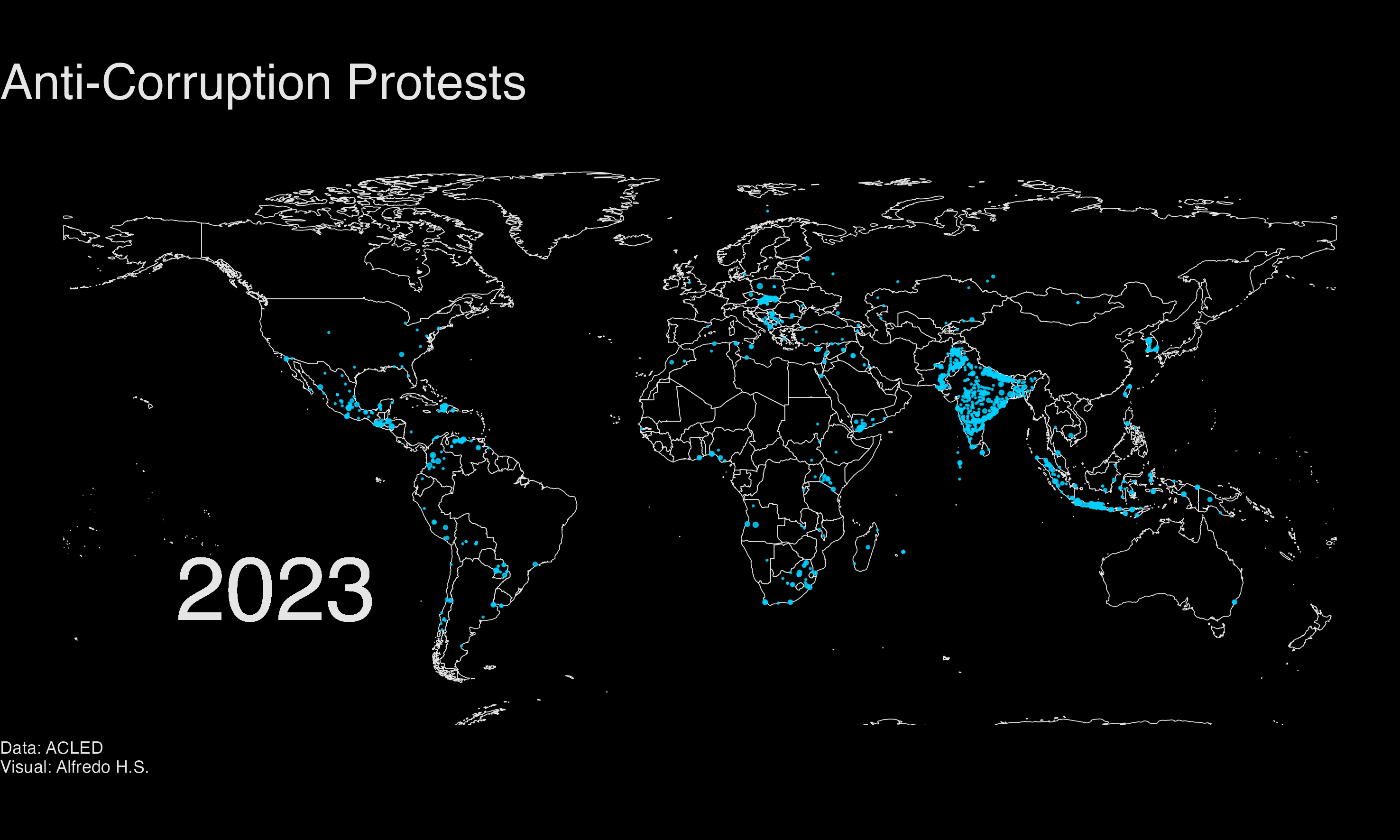
Maintaining consistent width, height, and units across every frame is critical. If frame dimensions vary, the resulting animation will jitter or appear distorted.
Step 5: Turn the Map Into a Function
Writing a discrete script for each year would be incredibly inefficient. Instead, we package the mapping logic into a custom function. The function accepts a specific year as an input and returns the fully assembled map for that year.
make_protest_map <- function(frame_year) {
  ggplot() +
    geom_sf(data = world, color = "gray90", fill = "gray0") +
    geom_sf(
      data = filter(df_coord_sf, year == frame_year),
      color = "#00CFFF",
      aes(size = log(crowd_size + 1)),
      alpha = .8,
      show.legend = FALSE
    ) +
    scale_size(range = c(.1, 1)) +
    coord_sf(xlim = c(-180, 180), ylim = c(-60, 90)) +
    geom_text(aes(x = -120, y = -30, label = frame_year), color = "gray90", size = 16) +
    labs(
      title = "Anti-Corruption Protests",
      caption = "Data: ACLED \nVisual: Alfredo H.S."
    ) +
    theme_anim_map
}
This represents the conceptual shift from drawing a static map to generating a systematic animation. The plot is now a reproducible recipe. We can test it on additional years to verify stability before proceeding.
make_protest_map(2019)
make_protest_map(2020)
Step 6: Make Many Frames
With a robust function in place, a for loop automates the production of the entire image sequence, creating one PNG file per year.
dir.create("images", showWarnings = FALSE)

years <- min(df_coord_sf$year):max(df_coord_sf$year)

for (i in years) {
  frame_map <- make_protest_map(i)

  ggsave(
    filename = sprintf("images/map_%s.png", i),
    plot = frame_map,
    width = 25,
    height = 15,
    units = "cm"
  )
}
The formatting command sprintf("images/map_%s.png", i) generates sequential filenames. Establishing a predictable naming pattern is crucial because it allows the animation software to read the frames back in the correct chronological order.
Step 7: Add a Blank Opening Frame
Although optional, including a blank opening frame is a widely used technique in data visualization. It provides the viewer a moment to absorb the geographic context before the data points begin appearing.
blank_map <- ggplot() +
  geom_sf(data = world, color = "gray90", fill = "gray0") +
  coord_sf(xlim = c(-180, 180), ylim = c(-60, 90)) +
  labs(
    title = "Anti-Corruption Protests",
    caption = "Data: ACLED \nVisual: Alfredo H.S."
  ) +
  theme_anim_map

ggsave(
  filename = "images/world_blank.png",
  plot = blank_map,
  width = 25,
  height = 15,
  units = "cm"
)
Step 8: Stitch the Frames Into a GIF
At this stage, the ggplot2 rendering is complete, and magick takes over to combine the disparate image files.
frame_files <- c(
  "images/world_blank.png",
  sprintf("images/map_%s.png", years)
)

frames <- image_read(frame_files)

animation <- image_animate(
  image_join(frames),
  fps = 10,
  delay = 75
)

image_write(animation, "map_corruption.gif")
The functions from magick follow a logical sequence: image_read() loads the PNG files from the directory, image_join() binds them into a contiguous image sequence, image_animate() applies playback settings, and image_write() exports the final result.
The parameters fps (frames per second) and delay control the pacing. Adjusting these values allows you to speed up or slow down the animation until the transitions feel appropriately timed.
The Full Workflow
Once the individual components are clear, the complete animation workflow can be compressed:
library(dplyr)
library(ggplot2)
library(rnaturalearth)
library(sf)
library(magick)

df_coord_sf <- readRDS("input/df_coord_acled.rds")
world <- ne_countries(scale = "medium", returnclass = "sf")
years <- min(df_coord_sf$year):max(df_coord_sf$year)

theme_anim_map <- theme_void() +
  theme(
    panel.background = element_rect(fill = "black", color = NA),
    plot.background = element_rect(fill = "black", color = NA),
    plot.title = element_text(size = 25, color = "gray90", face = "bold"),
    plot.caption = element_text(hjust = 0, color = "gray90"),
    plot.margin = margin(5, 5, 5, 5)
  )

make_protest_map <- function(frame_year) {
  ggplot() +
    geom_sf(data = world, color = "gray90", fill = "gray0") +
    geom_sf(
      data = filter(df_coord_sf, year == frame_year),
      color = "#00CFFF",
      aes(size = log(crowd_size + 1)),
      alpha = .8,
      show.legend = FALSE
    ) +
    scale_size(range = c(.1, 1)) +
    coord_sf(xlim = c(-180, 180), ylim = c(-60, 90)) +
    geom_text(aes(x = -120, y = -30, label = frame_year), color = "gray90", size = 16) +
    labs(title = "Anti-Corruption Protests", caption = "Data: ACLED \nVisual: Alfredo H.S.") +
    theme_anim_map
}

dir.create("images", showWarnings = FALSE)

for (i in years) {
  ggsave(
    filename = sprintf("images/map_%s.png", i),
    plot = make_protest_map(i),
    width = 25,
    height = 15,
    units = "cm"
  )
}

frame_files <- sprintf("images/map_%s.png", years)
frames <- image_read(frame_files)
animation <- image_animate(image_join(frames), fps = 10, delay = 75)
image_write(animation, "map_corruption.gif")
Summary Practices
To ensure reliable results when building animated maps, keep these practices in mind:
- Validate a single cross-sectional frame before running a loop to automate dozens of plots.
- Maintain identical output dimensions (
width,height,units) across allggsave()calls. - Enforce strict and predictable naming conventions (like
map_2020.png) to preserve chronological order when reading images. - Rely on animated maps to depict broad spatial-temporal changes, and supplement them with tables or static plots when exact figures are necessary.